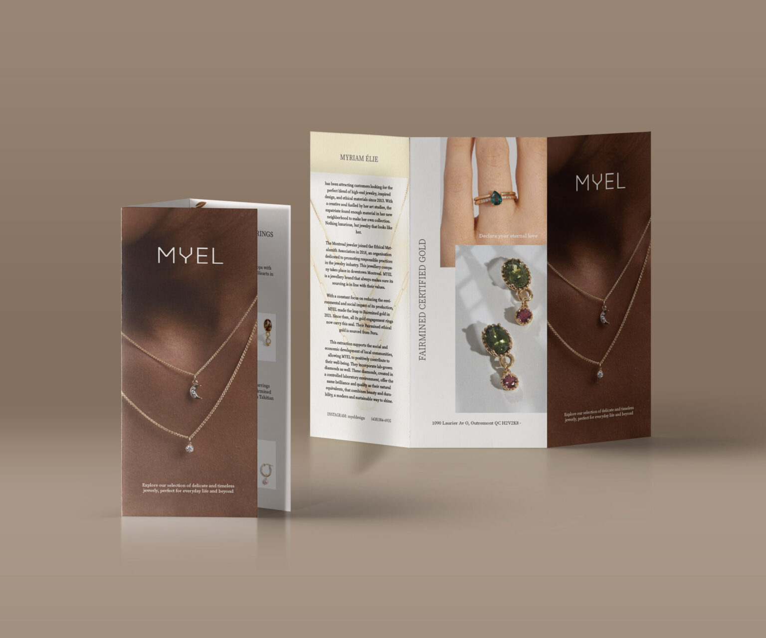
For this project, we were given three different companies to choose from for creating a brochure, and I decided to work with the jewelry brand Myel.
As I explored their website, I noticed a strong use of white and cream tones in their visuals, so I based my brochure’s color palette on those shades. I added a warm brown skin tone as well, which creates a nice contrast and prevents the design from feeling too monochromatic.
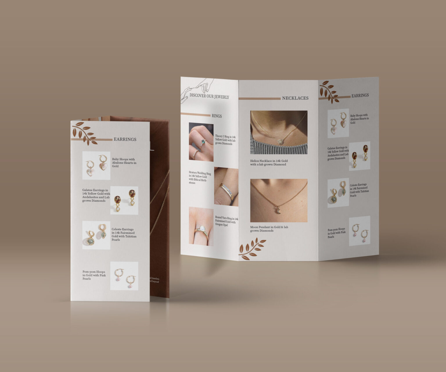
I chose a simple, clean layout for the jewelry display so the overall design stays clear and doesn’t overwhelm the viewer.