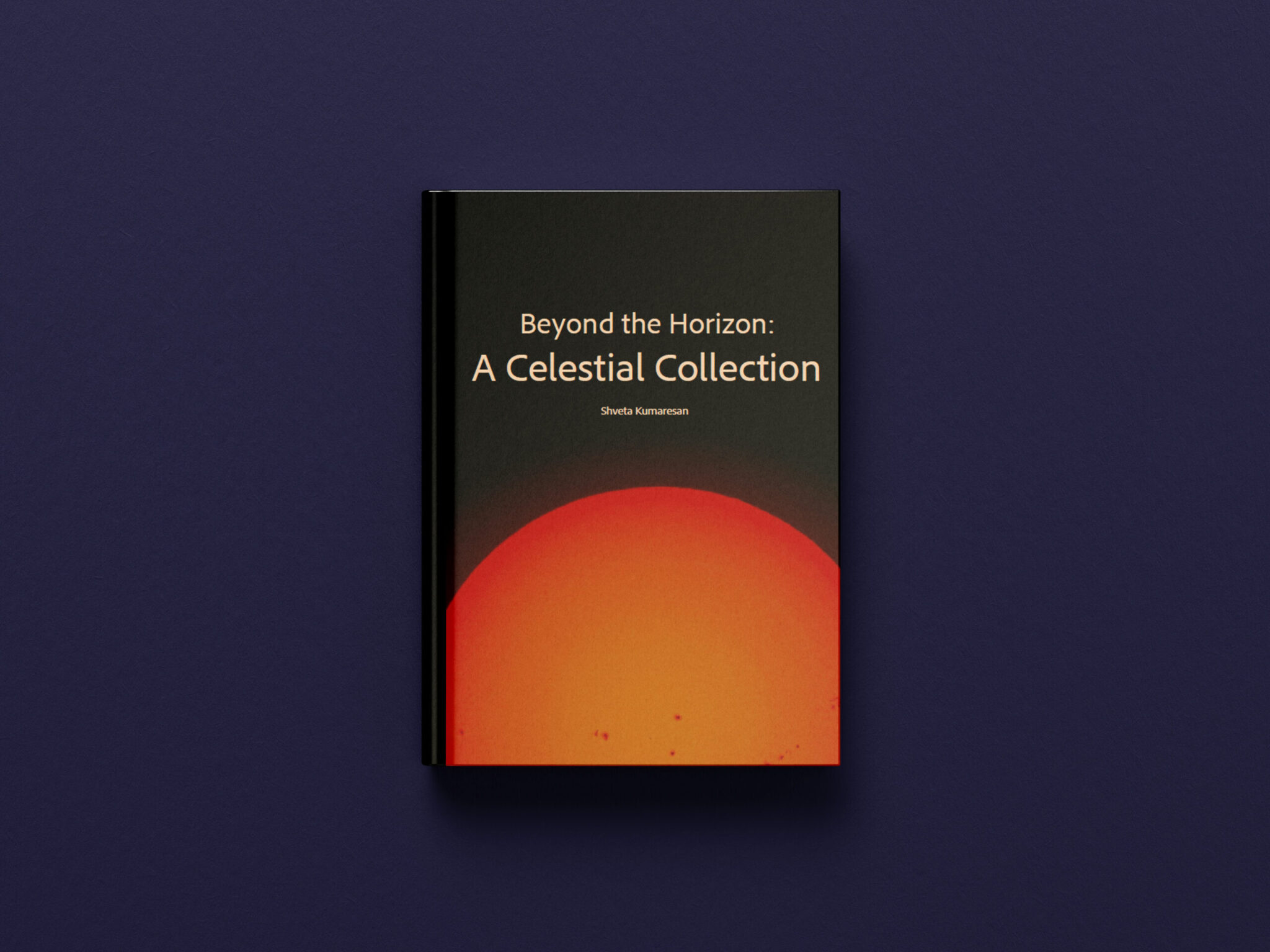
Photography Album
For this project, we were asked to create a photography album based on a topic of our choice, combining our own photos with written descriptions. I decided to dedicate my album to astrophotography, since space has always been something that fascinates me. My goal was to showcase the beauty of the night sky through my own lens, while also sharing some interesting information about each object I captured.
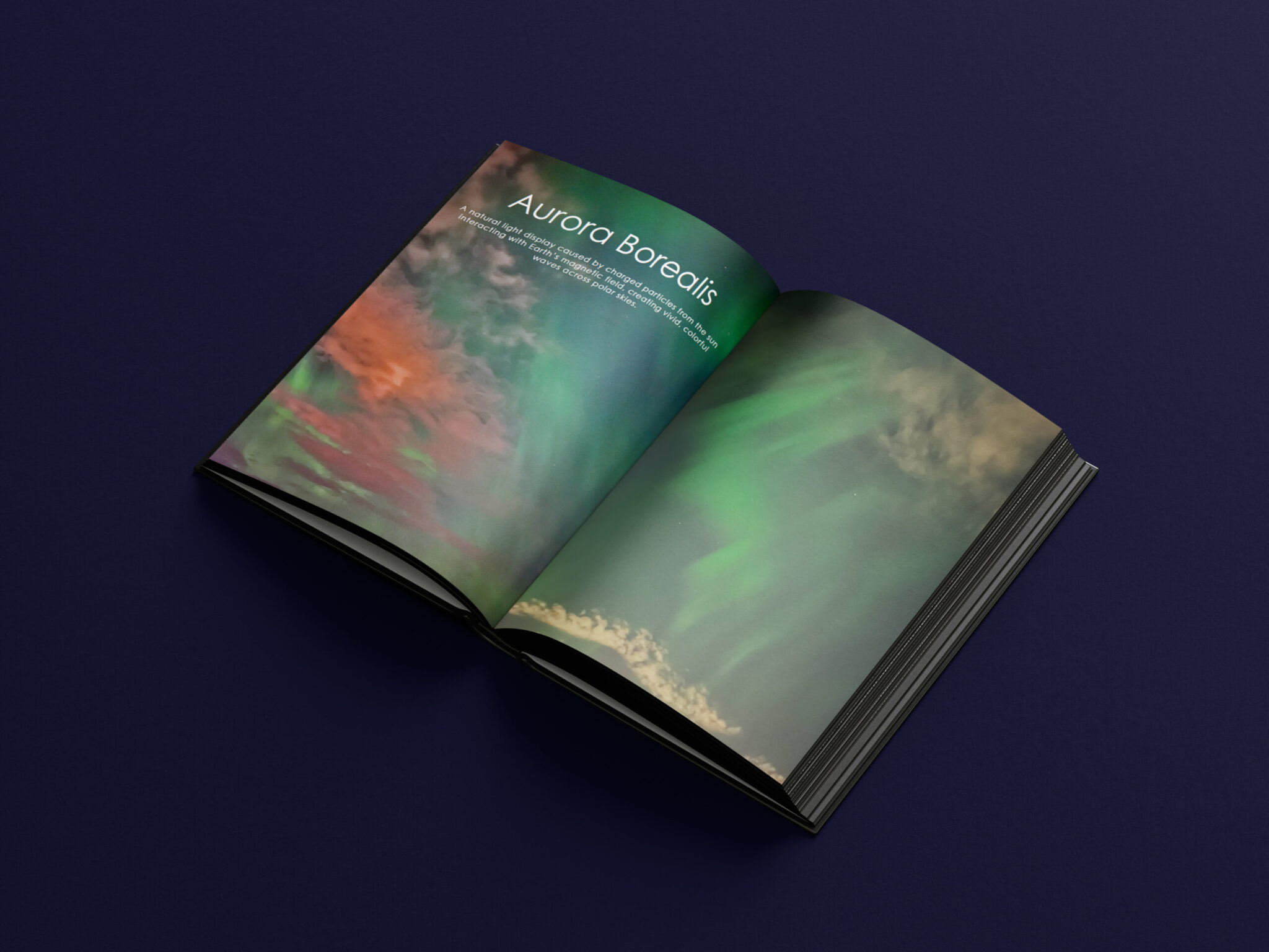
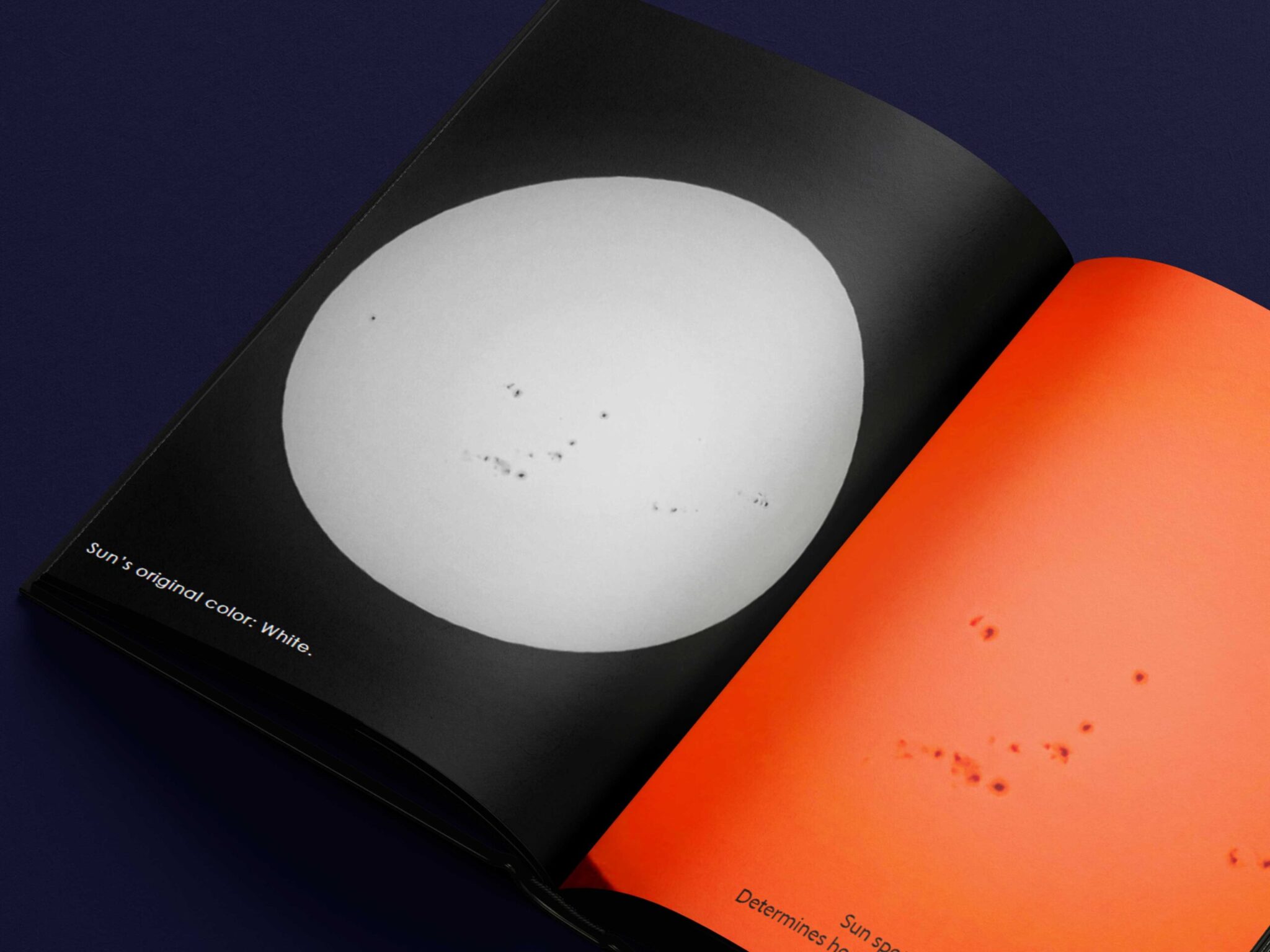
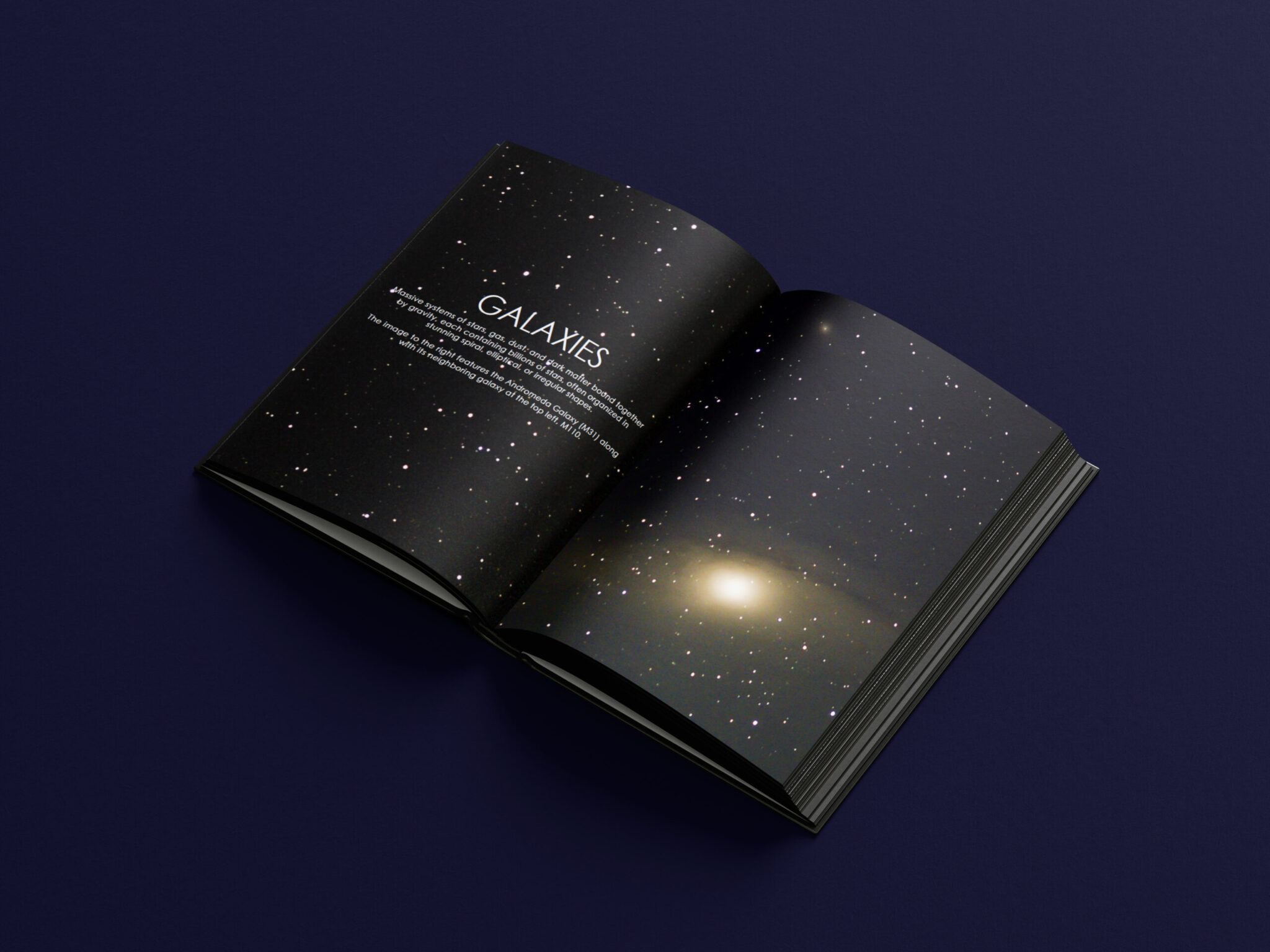
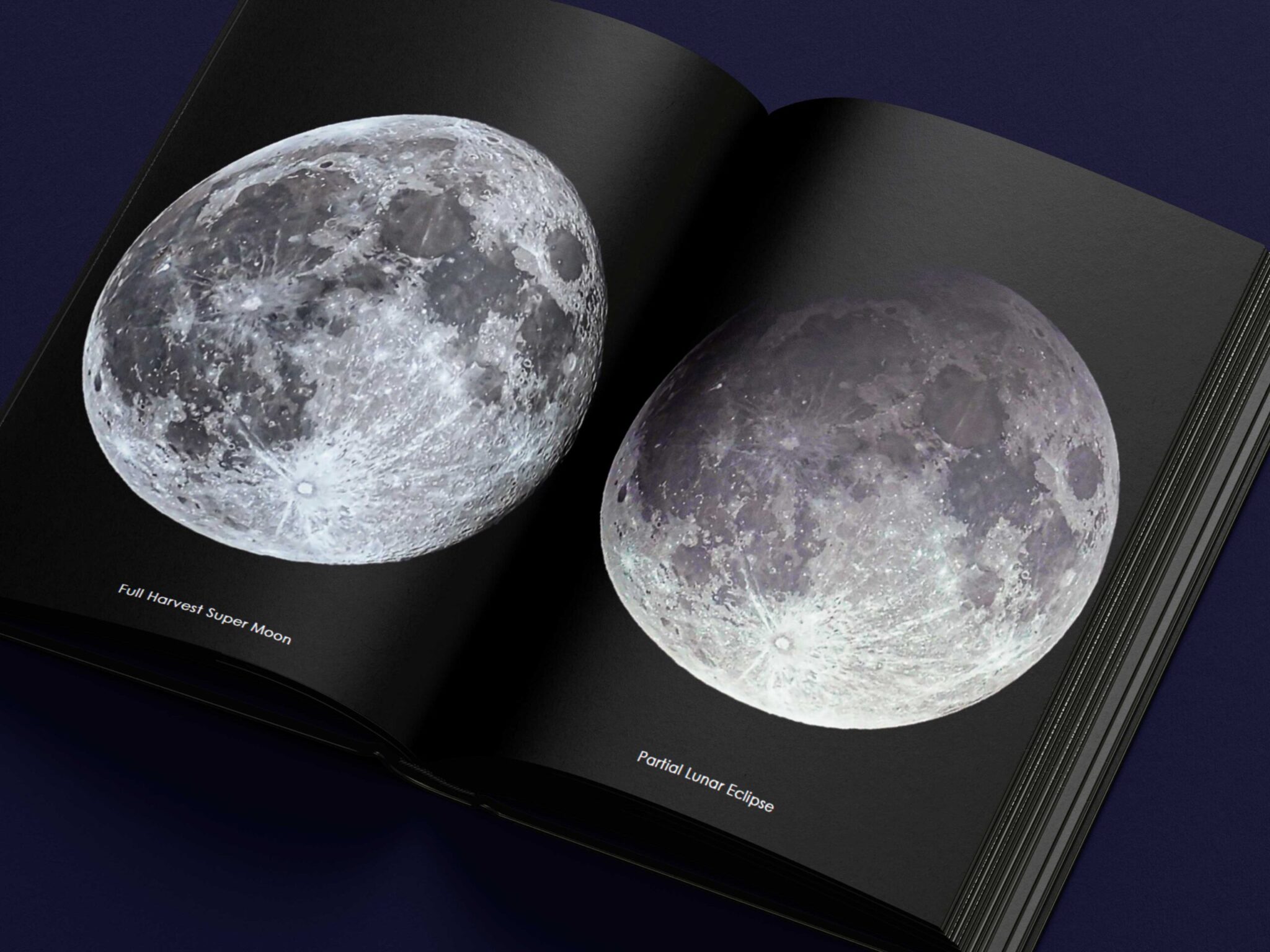
All the photos in my album were taken by me using a combination of tools: my phone, my Canon camera, and my SeeStar telescope camera. Each device offered a different perspective and level of detail, allowing me to experiment with various ways of capturing stars, planets, nebulae etc. After photographing, I spent a significant amount of time editing the images. My goal during the editing process was to make the photos appear more vibrant and livelier while keeping them true to the natural appearance of the celestial objects. Adjusting the brightness, contrast, and color balance helped highlight the fine details that make space photography so captivating.
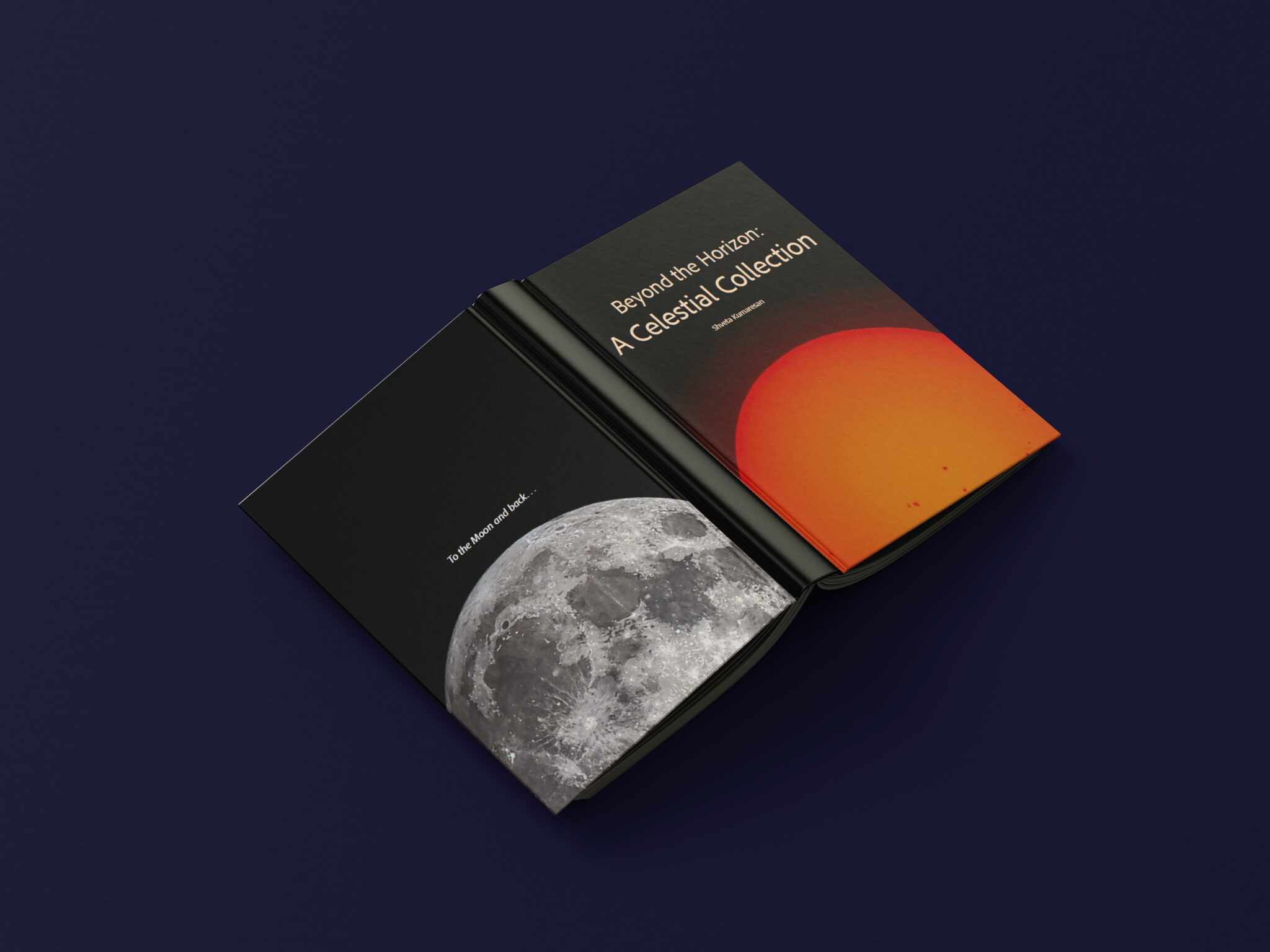
I chose to use a simple sans serif typography throughout the album. I found that this type of font complements the theme of space better than serif or cursive fonts. Space isn’t decorative or ornate—it’s scientific, vast, and mysterious—so a clean, modern typeface felt more appropriate. I also wanted to ensure the text was easy to read and didn’t distract from the images themselves.
Although some of my photos are colorful and others darker, I maintained a minimalistic layout overall. The intention was to let the photos speak for themselves and keep the viewer’s full attention on the details within each image. In the end, my album represents both my passion for astronomy and my growing skill in photography and design. I continue experimenting and learning.